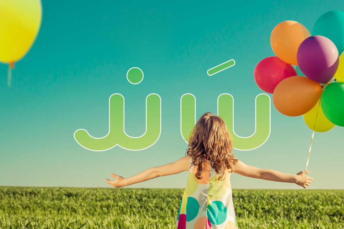
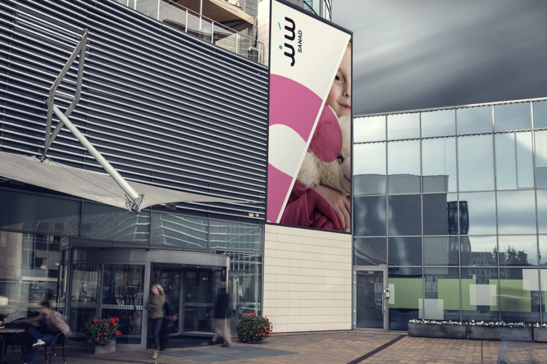
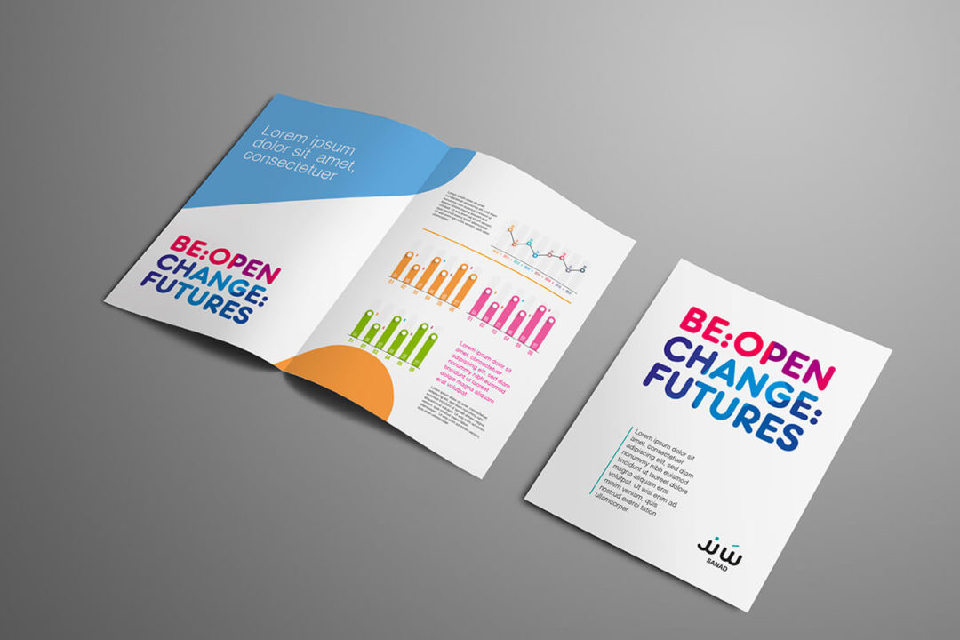
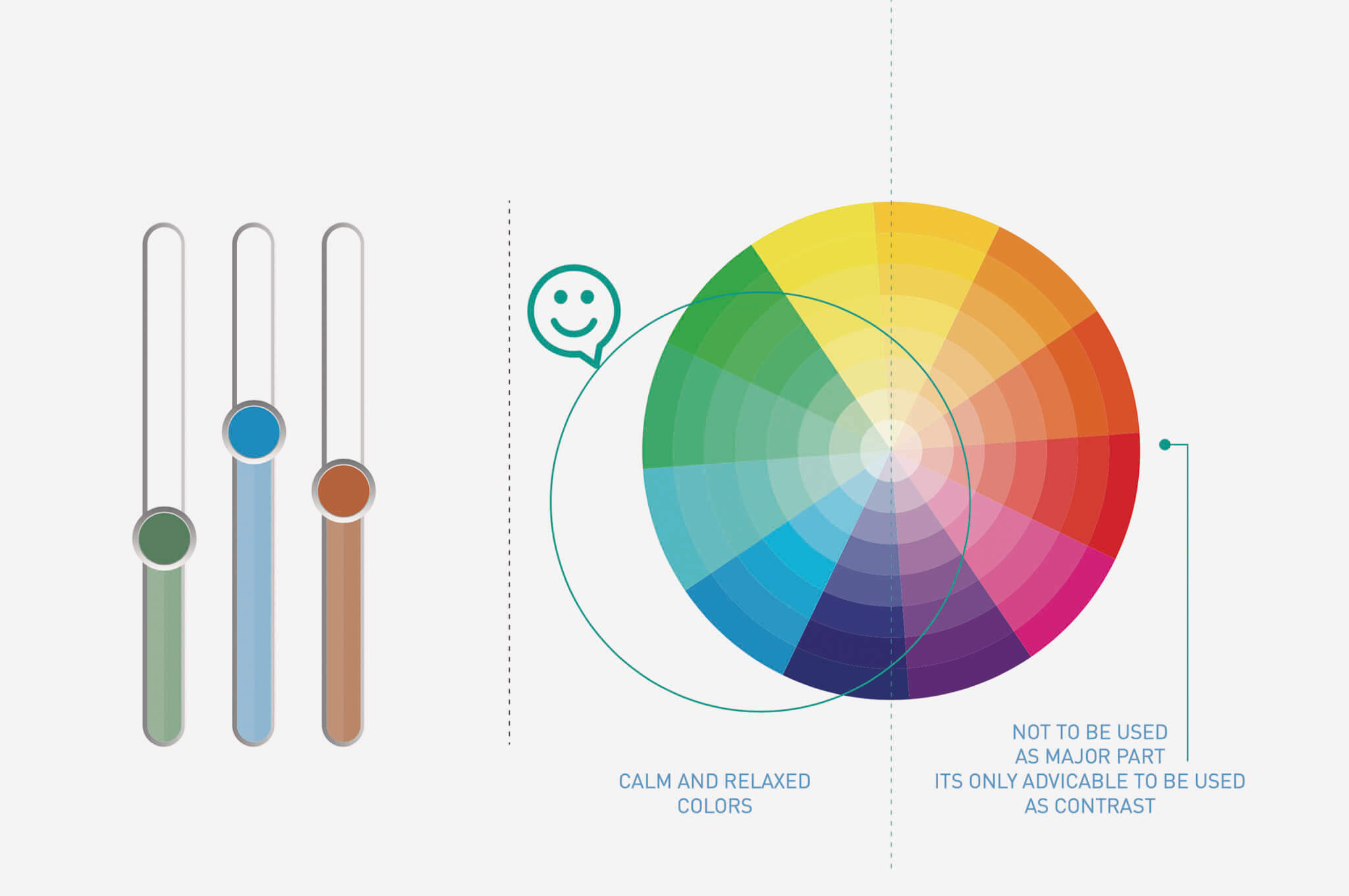
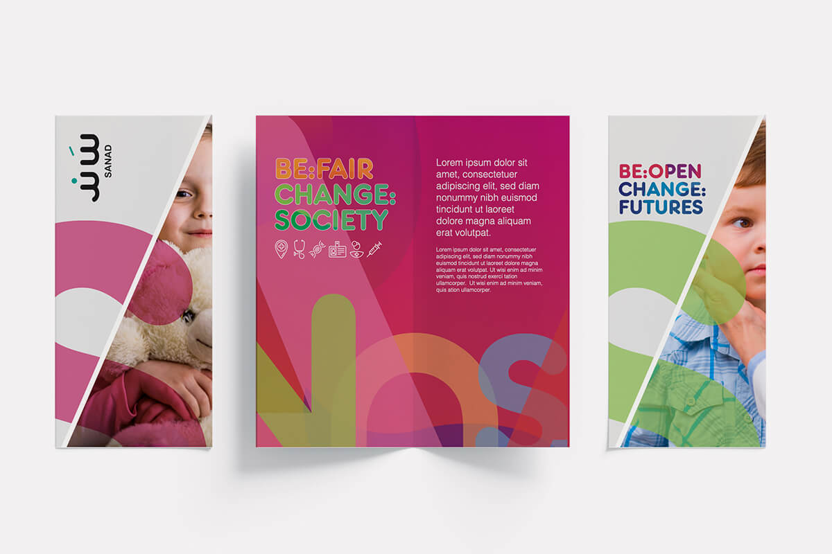
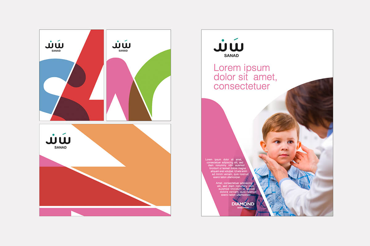
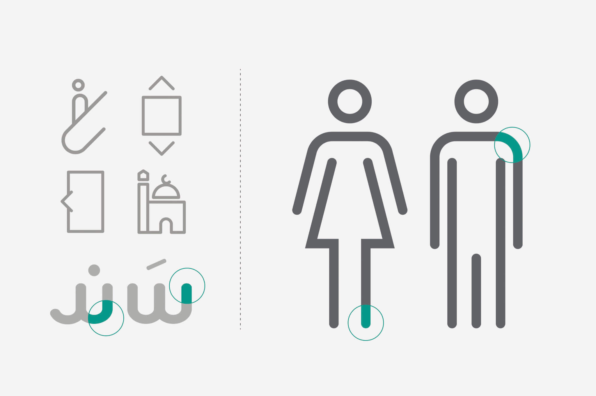
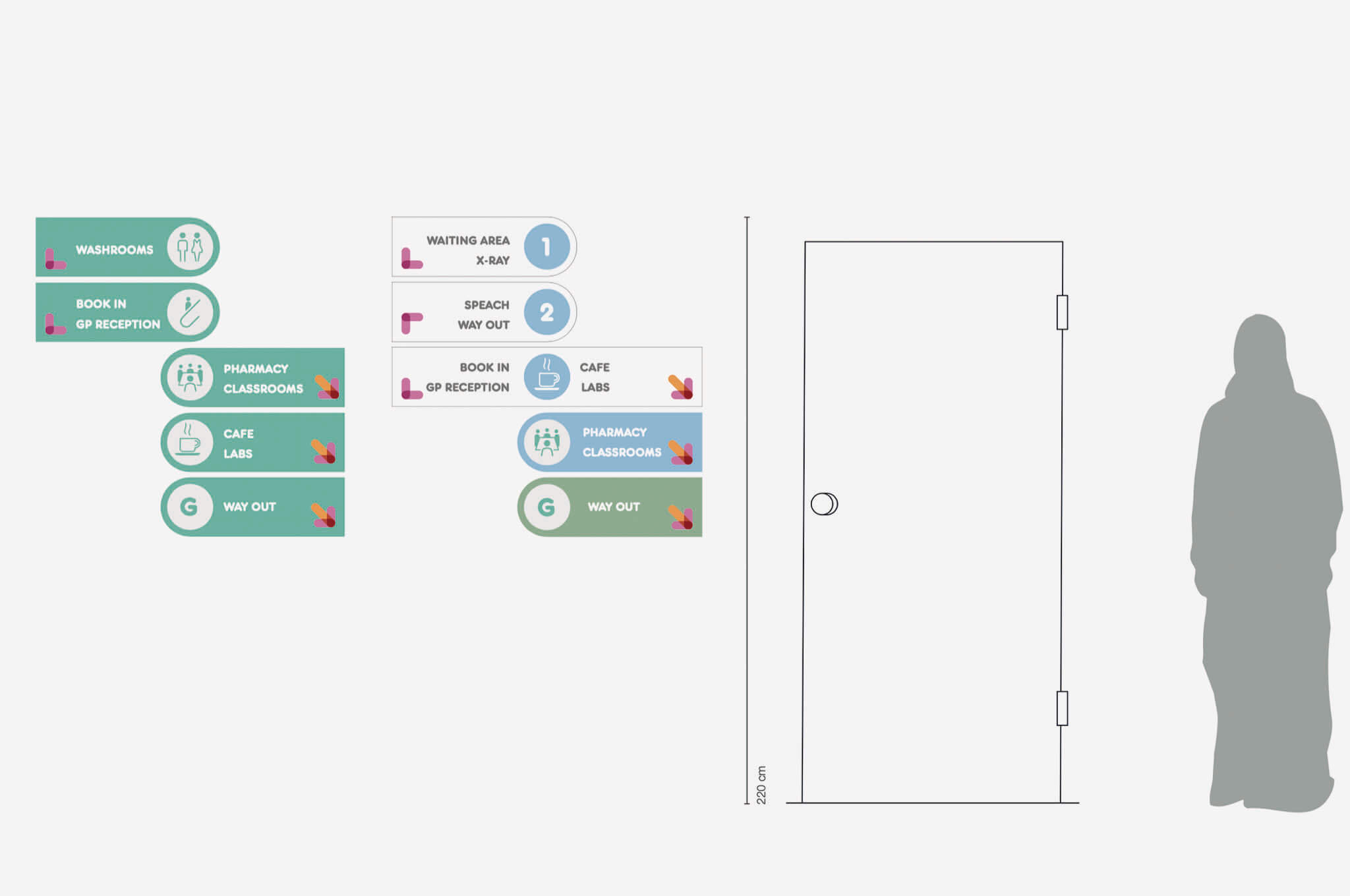
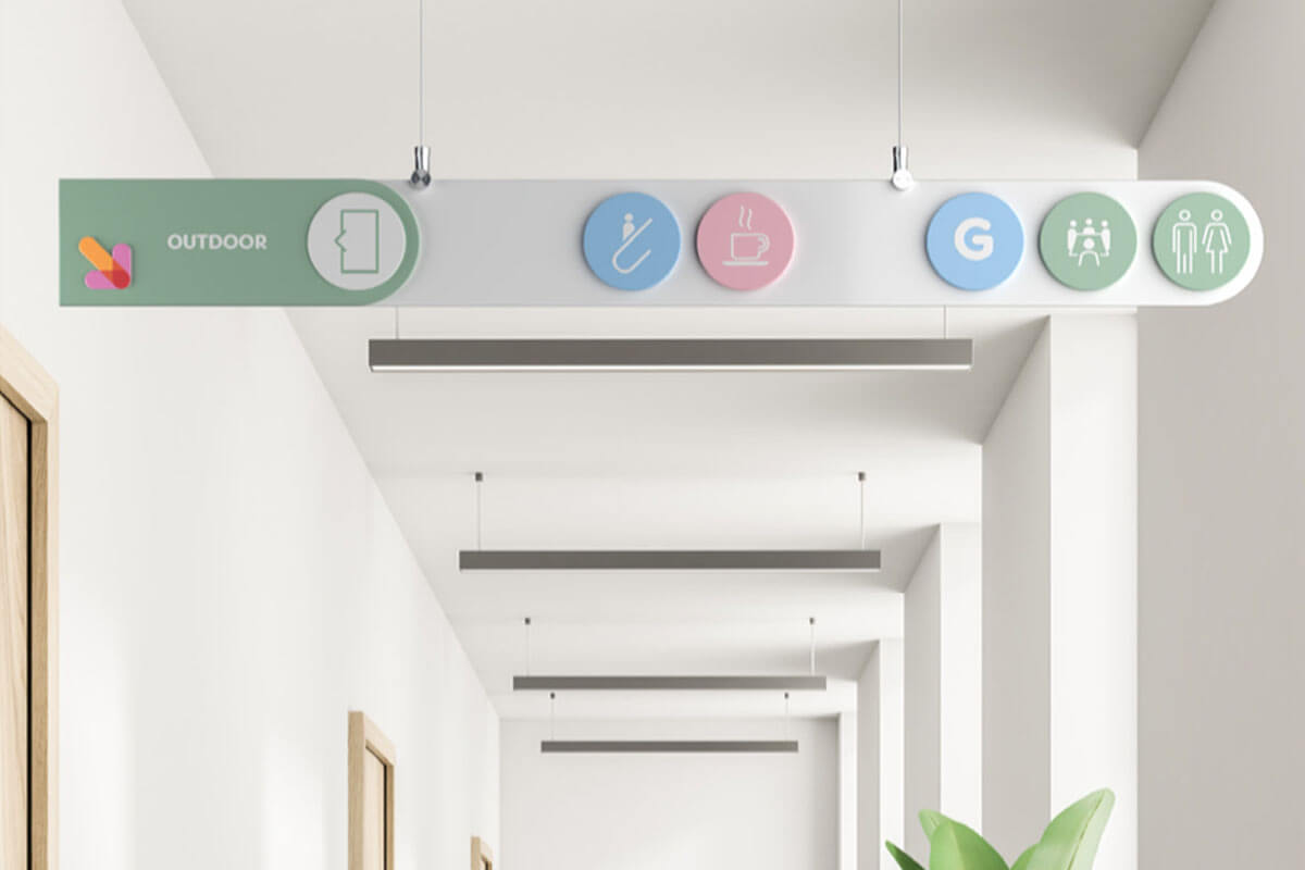
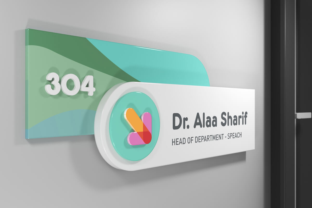
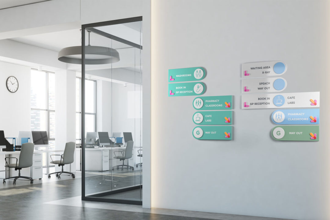
Sanad is a children healthcare facility in Dubai. As a brand is the set of expectations, memories, stories, relationships and experiences. In this branding project, to maintain a consistent children friendly brand look and feel, I have kept the visual tone, colour, typography, and layouts very flexible and children friendly.
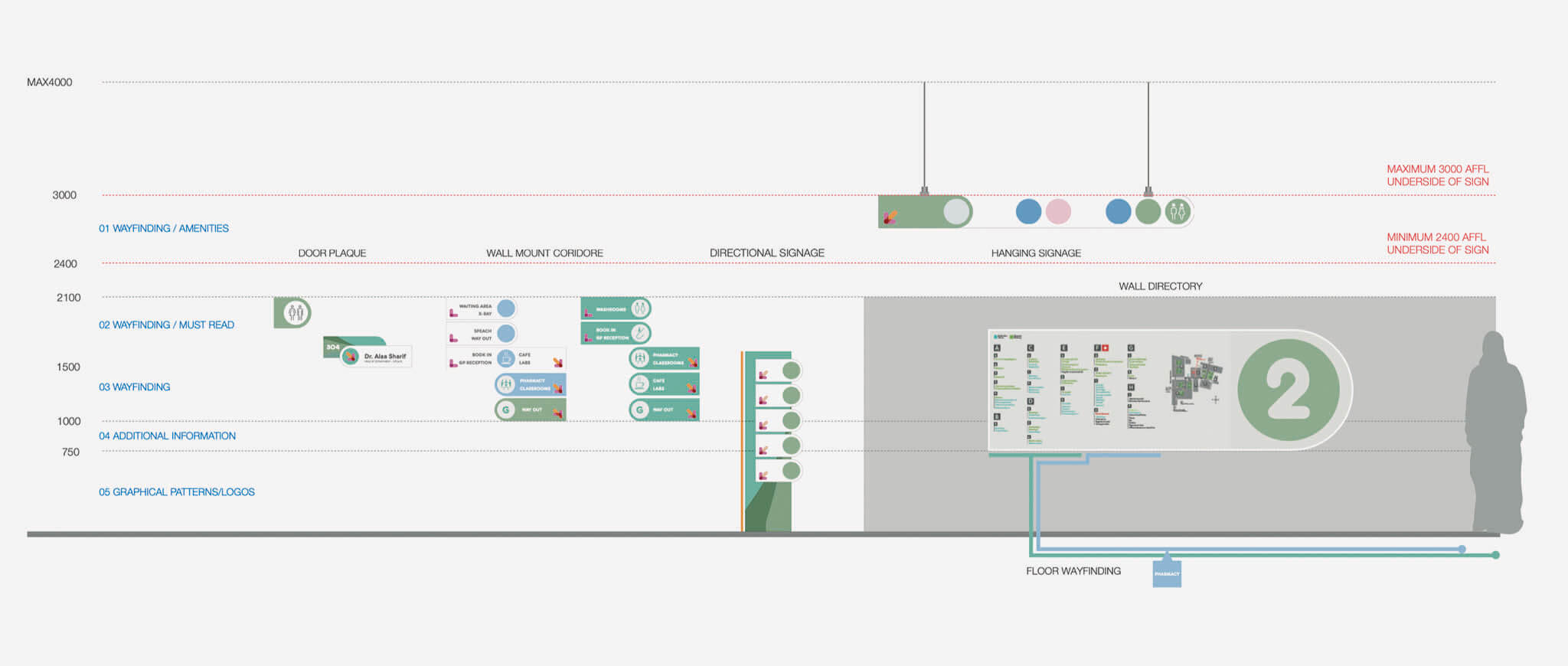
Thinking creatively about ways to explain procedures and clinical situations are part of the whole brand experience.
I have created an ideal hospital brand experience, where children and parents can feel confident, supported, cared and listened to, embraced and loved.