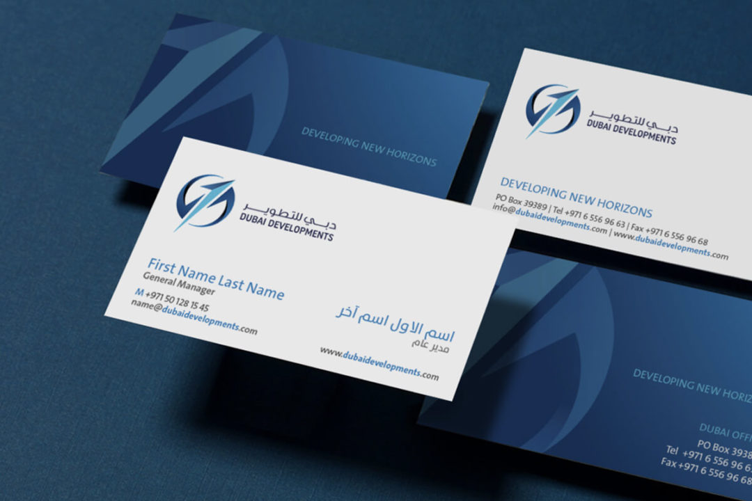
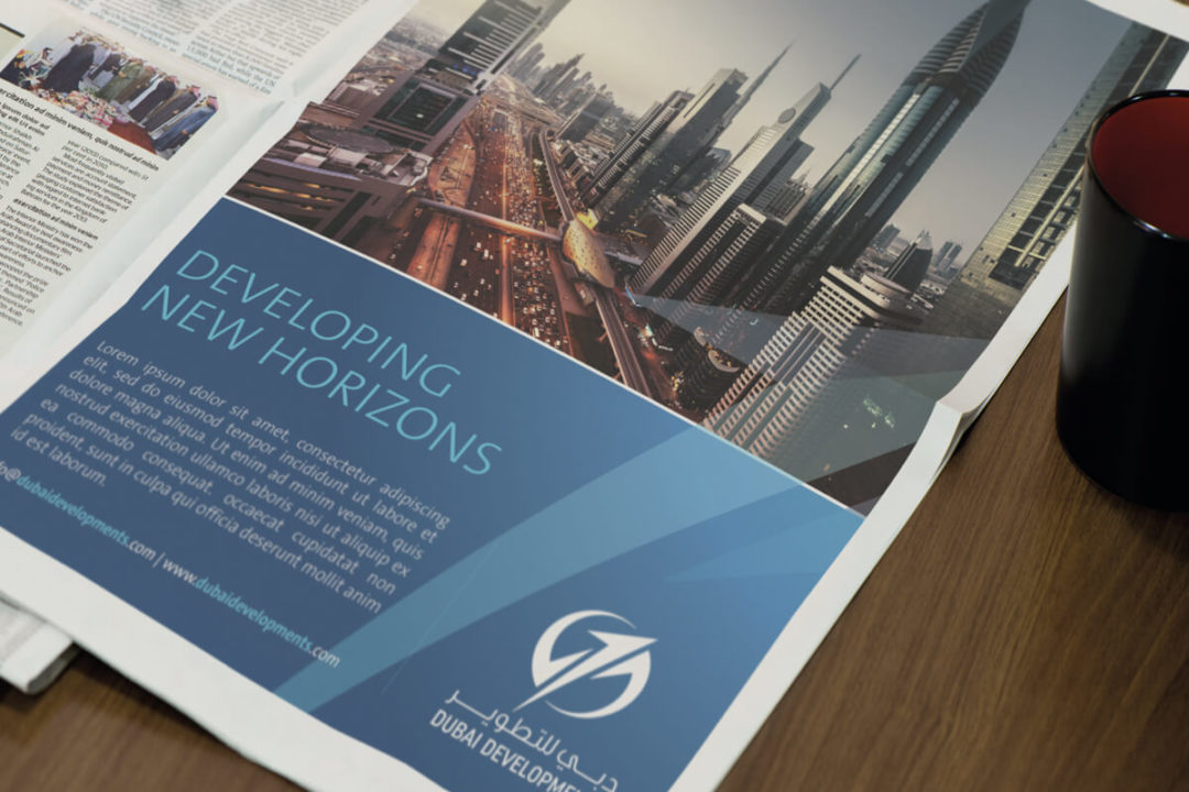
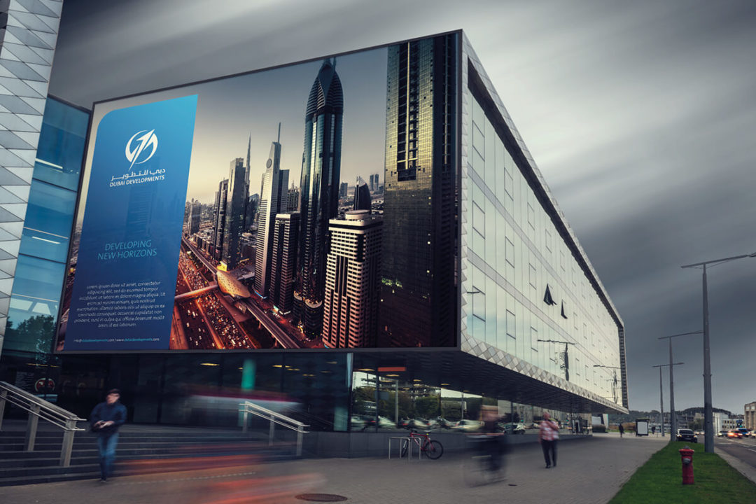
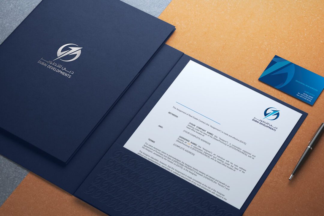
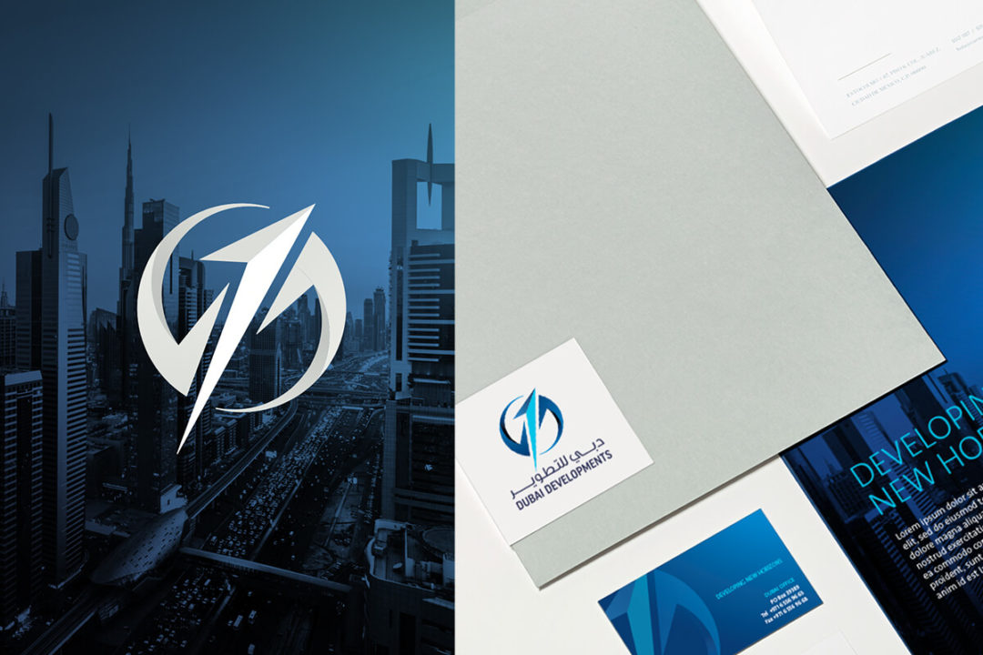
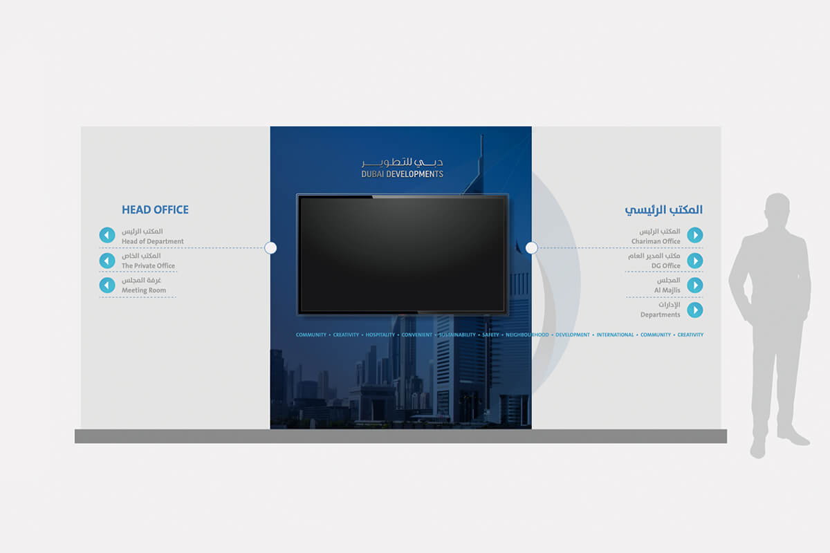
IDENTITY PROCESS + LOOK AND FEEL

I lead the creative team in complete rebranding process. We did a complete brand audit in all. the B2B and B2C 360 degrees touchpoints. the brand was in a total mess in terms of its graphic usage across the board. Although we did not have the privilege to redesign the brand mark but we manage to fine tune it. I have redrawn the emblem in a grid again to correct the shapes and its angles. A fresh new colour tone helped to recreate the atmosphere again in a better way.
branding_dubai-developments _2

Work Phases
After the brand audit and analyzing the problems, the project was delivered in three phases, in phase 1 we have refined and enhanced the brand mark and its construction, application into different sizes and brand look and feel. 

In phase 2 we have developed core system of layouts, shapes, colour palette, types, photographic style and signage systems. In the third phase we created a comprehensive style guide covering a full range of applications for operational use.

branding_dubai-developments _3
branding_dubai-developments _4
branding_dubai-developments _5
branding_dubai-developments _6

NATIVE APP UX

branding_dubai-developments _7

The visual identity guide was developed to set an exclusive standard for the method of applications of Dubai Developments brandmark across the line. This was a step towards maintaining the system in the company to keep brand’s image across the media and brand line. 

This was an illustrative tool of visual standard for preparation of all branded material in innovative and modern way. Dubai Developments were given this guide along the still photoshoot and videography style art direction, in printed hard copies and digital downloadable versions. 

branding_dubai-developments _10
branding_dubai-developments _11
branding_dubai-developments _12
branding_dubai-developments _13
branding_dubai-developments _14
branding_dubai-developments _15