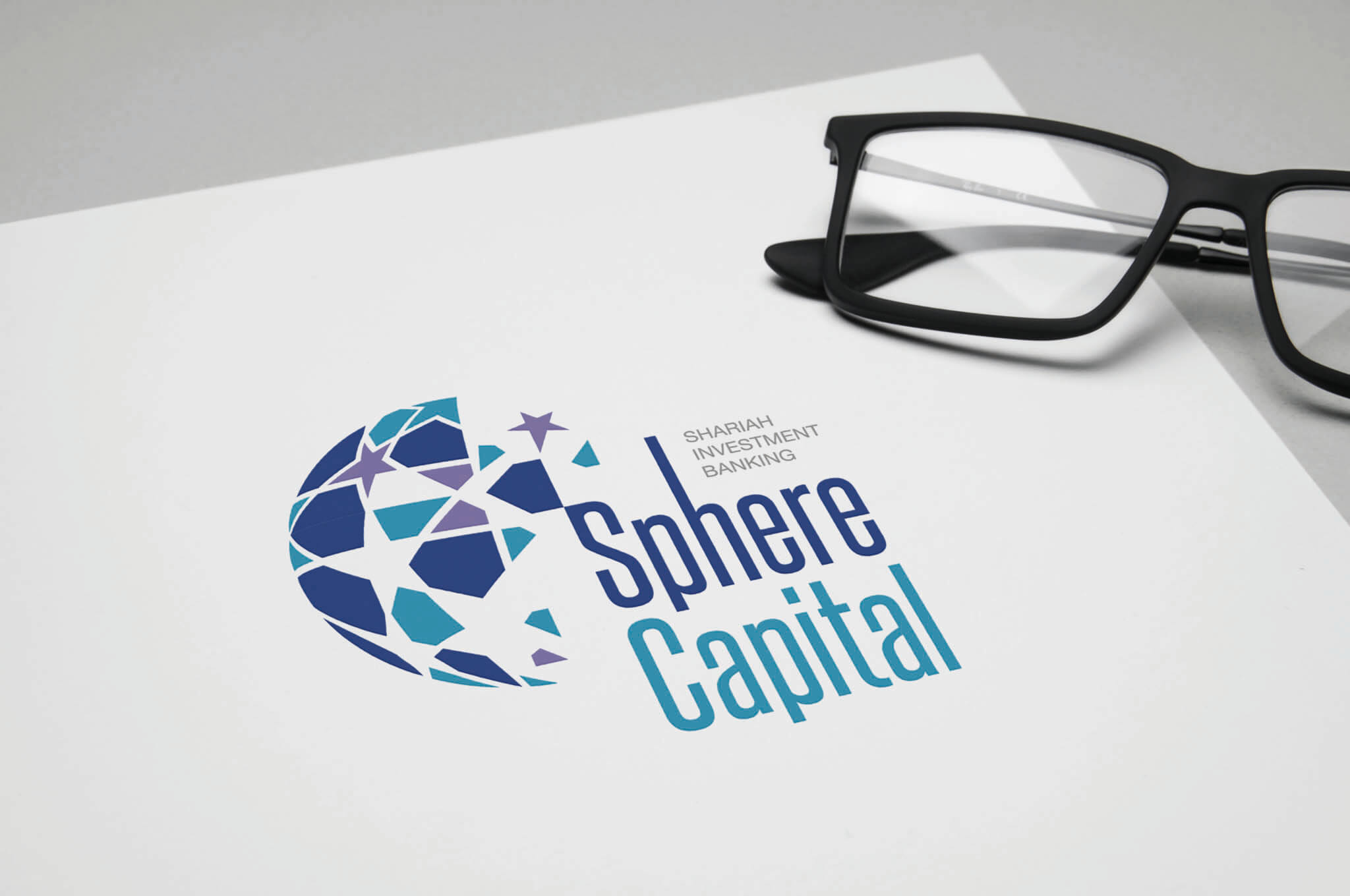
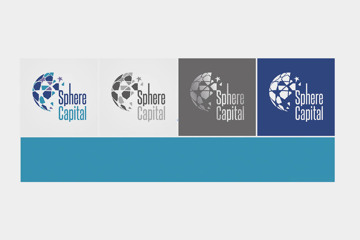
branding_sphere-capital_1

VISUAL IDENTITY

The evolved Islamic pattern brand identity gives prominence to the iconic arabesque symbol which represents shariah investments. A colour palette which takes its cue from the different parts of the horizon represents the growth in service offered by the company. The combination of colours and graphic pattern are animated in digital applications to give the brand a dynamic form.
branding_sphere-capital_2
branding_sphere-capital_3
branding_sphere-capital_4
branding_sphere-capital_6
branding_sphere-capital_5
branding_sphere-capital_7
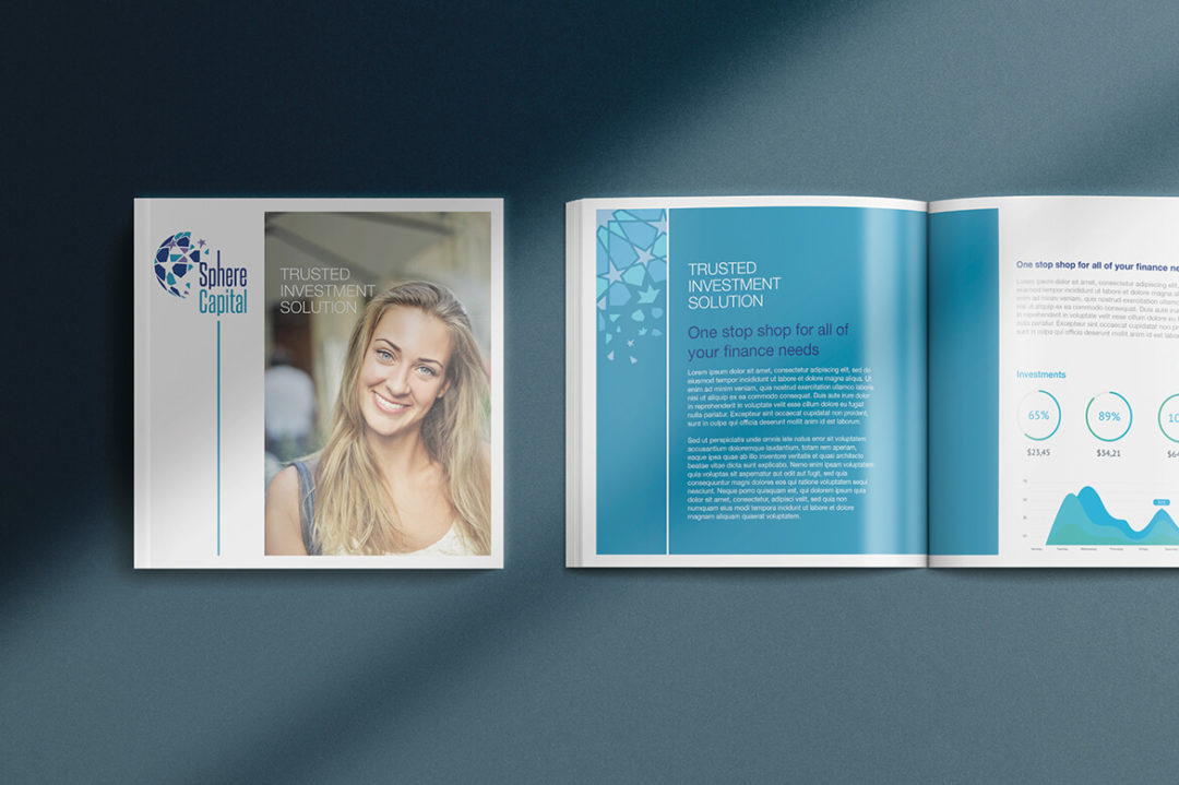
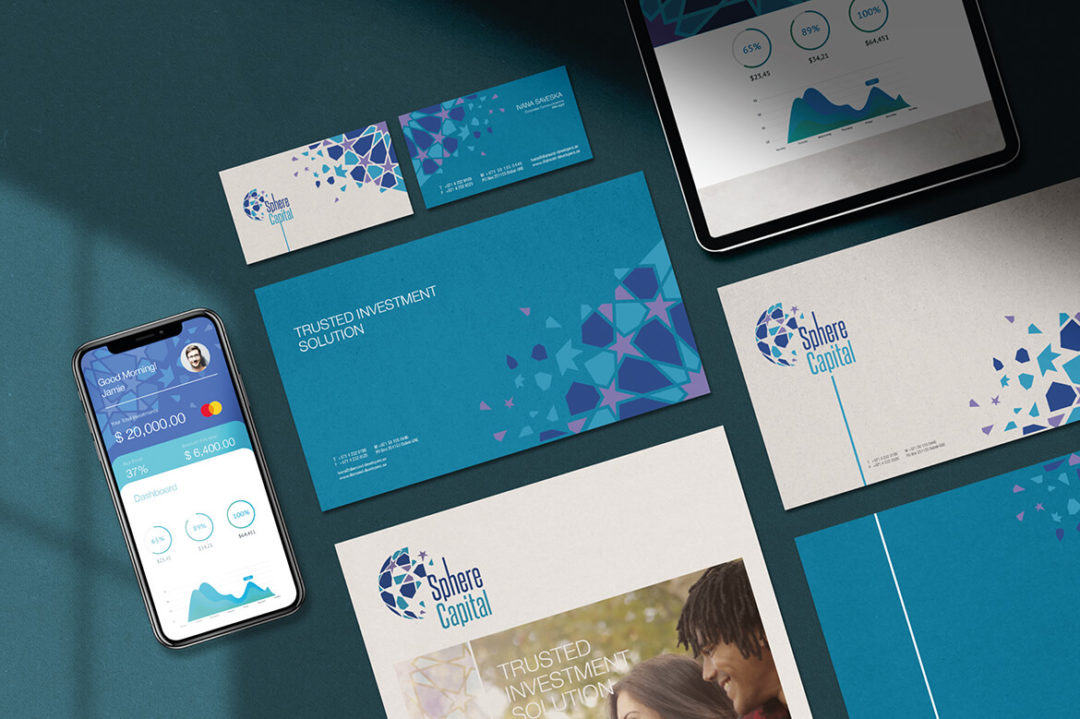
At the heart of the new brand is a bold statement, ‘trusted investment solution’ which captures the spirit of trust and innovation that has characterised the company over the years. It also represents a direct commitment to help customers succeed in their ambitions and enable them to make the most of the unique opportunities. At the heart of the new brand is a bold statement, ‘trusted investment solution.

This is one of those projects where I explored the brand as a whole experience and developed the visual identity of the brand, along with digital product system and UI design.

I was closely involved with the client and other stakeholders during working on this project to keep it align with clients methodology and strategic approach. Sphere Capital was a success starting from the launching phase with its soothing colour pallet for investment banking and simple to use UI and UX cross-platform design.

As a new face of financial technology market Sphere Capital needed a modern look with roots attached to culture and heritage as their sharia investment solution must be part of the visual identity.

Clean layouts controlled with arabesque graphics and widespread imagery gave a glance of visual identity for the and its message. This exercise helped later to develop a dynamic brand identity all across. Event agencies designed and produced some groundbreaking creative exhibition booths and animations for digital marketing and corporate videos.